The network of all of our partners
Have a look at this picture. If you are funded by the MFA, and you publish your activities in IATI – and publish them correctly – you are in there, somewhere.
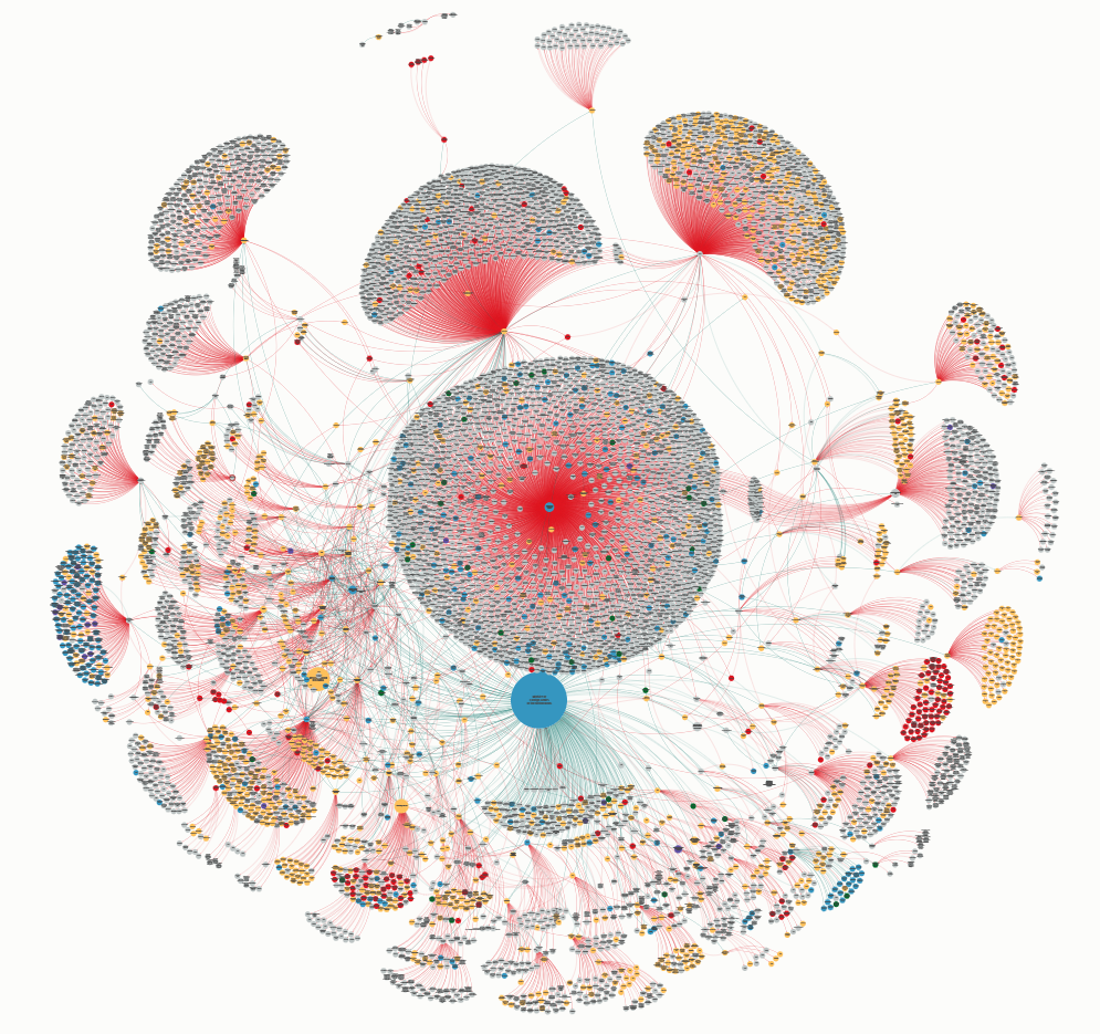
In this map, each dots is an organisation. Each line represents funding from one organisation to the other. Directly or indirectly, they are all funded by the MFA. We love this visual very much, because it shows that development cooperation and humanitarian aid are the work of collaborations. Donors like the MFA are a part of a puzzle, but that puzzle is much bigger than just us. The organisations furthest away from us in this visual are sometimes very small but always important, because they face the challenges we work on, head on.
This is one of the reasons why we have IATI: we need each of our partners to publish their part of the puzzle, so we and others in the field see who works on which challenges, and where. We use this data in dashboards and geographical maps, and we encourage others to use it as well.
This Kumu visualisation also plays a big part in a talk which we held at the IATI Community Event 2023, on March 16, in Copenhagen.
Want to see this network ‘live’? Go see it as it currently exists, based on today’s IATI data, on the Kumu website. And while we are on the topic of links, are you sure you have linked your activities to ours properly?
To keep up with important news from the ministry about IATI, please sign up for our quarterly newsletter here.