Use your IATI data for an alliance dashboard
One of the ways IATI can benefit the publishing organisation itself, is by using it for partnership dashboards. Because all partners publish their data in the same IATI format, dashboarding is relatively easy and the information is already publicly available. To inspire current alliances, we highlight two examples here. One partnership is relatively small, with 5 members. Their dashboard was a quick process and is maintained by the lead partner itself. On the other extreme there is a large permanent alliance with an ambitious dashboard, built by an external IT business.
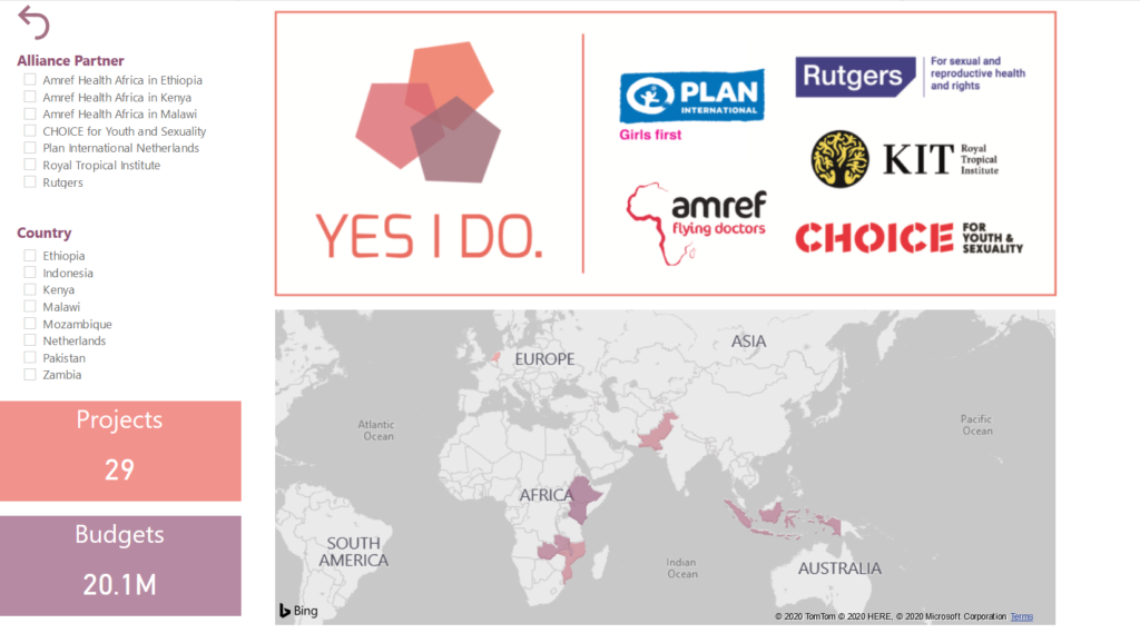
Yes I Do Alliance
On a relatively small scale, the Yes I Do Alliance is an alliance of five partners. It ran from 2016 to 2020, and had a dashboard very early on in its existence, to replace an endless stream of spreadsheets and reports between partners and the alliance coordinator. It was built internally in Power BI, by the data analyst working in the lead organisation (Plan International Netherlands) in collaboration with a small IT company that had no previous IATI experience. Yet, the difficulties here were not technical. Creating this dashboard was a matter of weeks, in part because of the smaller scale, and also because Yes I Do as an alliance already had very clear agreements in their MEL working group about how to publish their data, so there were few data structure issues. But, as the interview with Plan’s operational programme manager on this website mentions, “the challenge is deciding what it should look like.” Read the full interview published in September last year.
This first dashboard became the basis for many others. The external help is no longer necessary. Currently, Plan International is the lead for several new alliances and there are IATI dashboards planned for all of them.
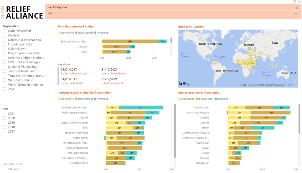
Dutch Relief Alliance
The Dutch Relief Alliance (DRA) is the other extreme: a very large partnership of 16 Dutch partners, focusing on urgent humanitarian crises everywhere. Unlike most other partnerships funded by the Ministry of Foreign Affairs, it has a permanent character. Within the DRA, there are temporary ‘sub-alliances’ which run a ‘joint response’ against a specific humanitarian crisis. One of the DRA members take the lead in a joint response, and others contribute with their own activities.
The DRA dashboard started as a way to monitor partners’ IATI data quality, but has developed into a tool for internal and, to a lesser extent, external communication. Peter Das, who works with ZOA as their team leader MEAL, is the Chair of the alliance’s M&E Taskforce. “Publishing in IATI was a requirement, and we also were ourselves aware of the importance of transparency. But in a partnership of 16 organisations with very diverse levels of experience in IATI, this was a challenge – especially in 2016, when IATI was still relatively new. We needed a tool where the lead for each joint response could monitor the data quality and missing data, because the leads are responsible for IATI for the whole joint response. We decided on a dashboard in Power BI, made by an external IT partner, with the intention to move the maintenance in-house at some point. That’s also why we chose Power BI: a lot of partners already have it as part of their Microsoft package, and it’s also quite easy to learn. You don’t need to be an expert data analyst.”
The dashboard is now used for much more than fixing the data. “Initially, there was some hesitance to make the dashboard publicly accessible, because if your data isn’t good enough yet, you don’t want to throw it out there. Incomplete data will raise eyebrows. Once that was no longer an issue, it became a communication tool, if only internally at first. If a member of the DRA wants to know something about a joint response, for example how much money is involved, what the project is about, which results are achieved, this is the easiest place to find it. But the leads still also use it to check the data, and besides all of this, it’s also an important tool for us to be transparent. We want to show what we are doing. And it seems to be working because the DRA dashboard is presented as a use case of open data a lot, for example in an UNOCHA symposium a few years ago and more recently in a GIZ hosted webinar for German NGOs about using IATI data.”
“There is still a long road to true data-driven working,
but at least we’re underway”
“Dashboards really create an upward cycle,” says Peter. “People love to see their data visualised, and it motivates them to get it right. Whenever we show it to someone, they are pleasantly surprised how much you can find there. This process started very slowly, but it’s really taking off now. I get more and more emails from members about it. Some people in the DRA do find it a very slow process, and it is. It just takes time.”
Any plans for the future? “Yes, we are just this week discussing the new phase. What do we want to do with this dashboard for example in external communication? Personally, I would love an option to export PDFs from the dashboard, based on a selection of data you have made, so you can use that as a brochure, for reports, or in marketing. We also want to use the dashboard as a way to show that we want to become more and more data driven. The image of an open, transparent alliance is important to us.”
There have been struggles in getting to the dashboard as it exists today. Peter: “We have a good relationship with the developer of the dashboard, but initially we didn’t specify in enough detail with them what both of us considered to be a minimal viable product. That has led to misunderstandings and delays. Once we got that sorted out, things ran a lot more smoothly.”
Does Peter think the fast pace of humanitarian projects takes a different approach to IATI than other development aid? “Not sure… Maybe it could be simpler reporting on results, but with a higher frequency, so you see what’s happening in real-time. On the other hand, we should not make it a big administrative burden. I find that a dilemma. In general, I think there is still a long road to true data-driven working, but at least we’re underway.”